The Shape of the App Store, Redux
Posted on January 20, 2015
Since publishing my piece on revenue distribution in the App Store yesterday, I’ve gotten some feedback from readers asking how valid my extrapolated data is. Some have pointed out that I’m working with a limited data set from only one app that might not hold for all apps. Others have pointed out that the daily revenue data that Marco Arment provided did not include any data from the period when Overcast was at the top of the U.S. Top Grossing list, so it’s possible that the curve isn’t really a strict power curve all the way up the charts.
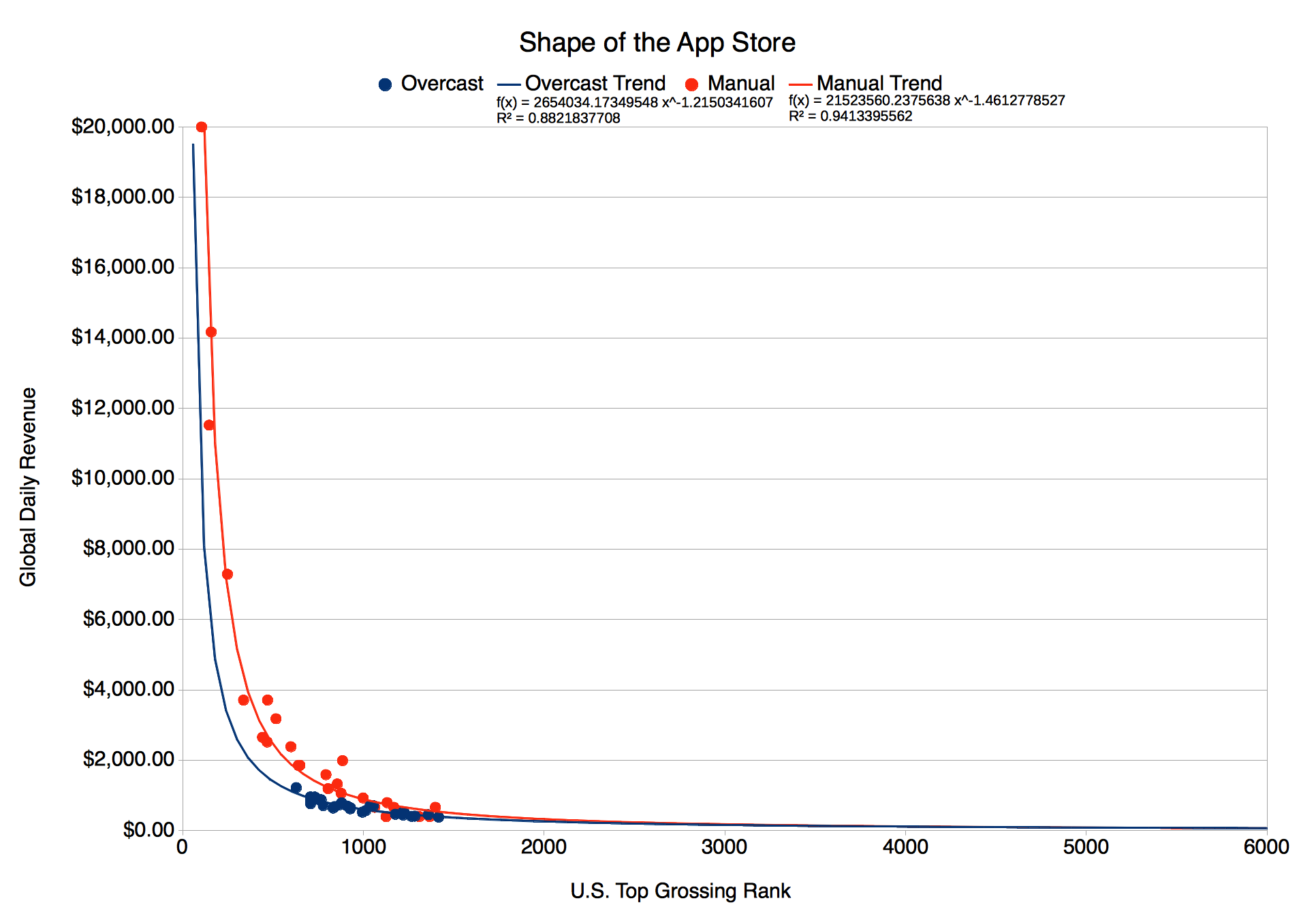
These are valid criticisms. So let me respond by releasing more data; the only other useful data that I have available. In response to Marco’s post, William Wilkinson published financial data from his own app, Manual. Manual is a photography app that did well on the U.S. Top Grossing list (reaching as high as number 104) in September 2014, so the Manual revenue data is both contemporaneous with Overcasts’s and useful for examining the upper reaches of the App Store. The problem with the data Wilkinson released is that the daily revenue graph has a very low resolution. In reading the graph, I could estimate daily revenue to only ±$133. That’s not such a big deal at the high end, where daily revenue is measured in the tens of thousands of dollars, but in the long tail where revenue is measured in the hundreds of dollars, a $133 error is quite significant. With this limitation in mind, below is the graph of Manual’s data overlaid onto Overcast’s.
As you can see from the graph, the revenue curve for Manual breaks upwards a little before Overcast’s does, but overall they are very similar curves. In particular, notice that the “head” end of these graphs (U.S. Top Grossing #1 to about #1000) follow similar paths. It seems likely to me that the differences between the graphs can be accounted for by the daily fluctuations of the App Store, differing ratios of U.S. to global sales, and the inherent inaccuracy that comes with estimation.
So what does this mean? Well, it makes me think that I was on the right track with my original post. While the the exact revenue figures that I cited in The Shape of the App Store may be off little, it seems likely that they are at least in the right ballpark. They may even be somewhat conservative estimates if Manual’s revenue figures are to be believed. Whatever the exact figures, one thing is clear: Revenue is heavily skewed towards the top of the charts, to a much higher degree than I, at least, expected.

