Month
June 2013
At WWDC this year, one topic of conversation that came up over and over was how to design for iOS 7. Like a lot of indies, I usually do much of the interaction design of my apps myself and use a proper designer only for the graphical design. This was feasible for me in the past not because I’m particularly gifted at interaction design, but because I always had plenty of examples to draw inspiration from. Apple’s built-in apps were, of course, the archetype for how an iOS app should behave, but lots of third-party apps also gave great examples of how to tackle the interaction problems that I encountered in my own apps. Now, of course, I see the weakness of that strategy. It worked great under iOS 6 because of all the third-party examples I could draw upon, but iOS 7 is a reset. Right now, there are exactly zero apps in the App Store that are designed for iOS 7, and that lack of example and inspiration is going to be a problem for me and for a lot of other indies as we prepare for the launch of iOS 7.
My concerns over iOS 7 preparations lingered during WWDC, but once I returned home I realized my mistake. In fact, there is already an app in the App Store from which I can draw inspiration for this new style. An app that adopts the look and feel of iOS 7 by elevating the content over the chrome. An app that uses color and animation in the style of iOS 7 to clarify content. [pullquote align=”right”]”For all intents and purposes, Vesper is the first iOS 7 app in the App Store.”[/pullquote] I realized that, for all intents and purposes, Vesper is the first iOS 7 app in the App Store. Despite being an iOS 6 app, Vesper adopts the major idioms of iOS 7 and serves as a great example of how developers can adopt those same idioms and still retain an individual identity for their app.
You may already be familiar with Vesper. It’s a notetaking app that launched towards the beginning of June 2013, just a few days before WWDC, and got a lot of press coverage in Mac and iOS circles. Vesper was created by Q Branch, which is made up of three people familiar to the iOS developer community: John Gruber, the writer behind Daring Fireball; Brent Simmons, the creator of NetNewsWire and Glassboard; and Dave Wiskus, a respected designer and the co-host of the Unprofessional podcast. It was clear from the beginning that these three created a great app, but it wasn’t until after WWDC that I realized Vesper actually anticpated a lot of what makes iOS 7 different.
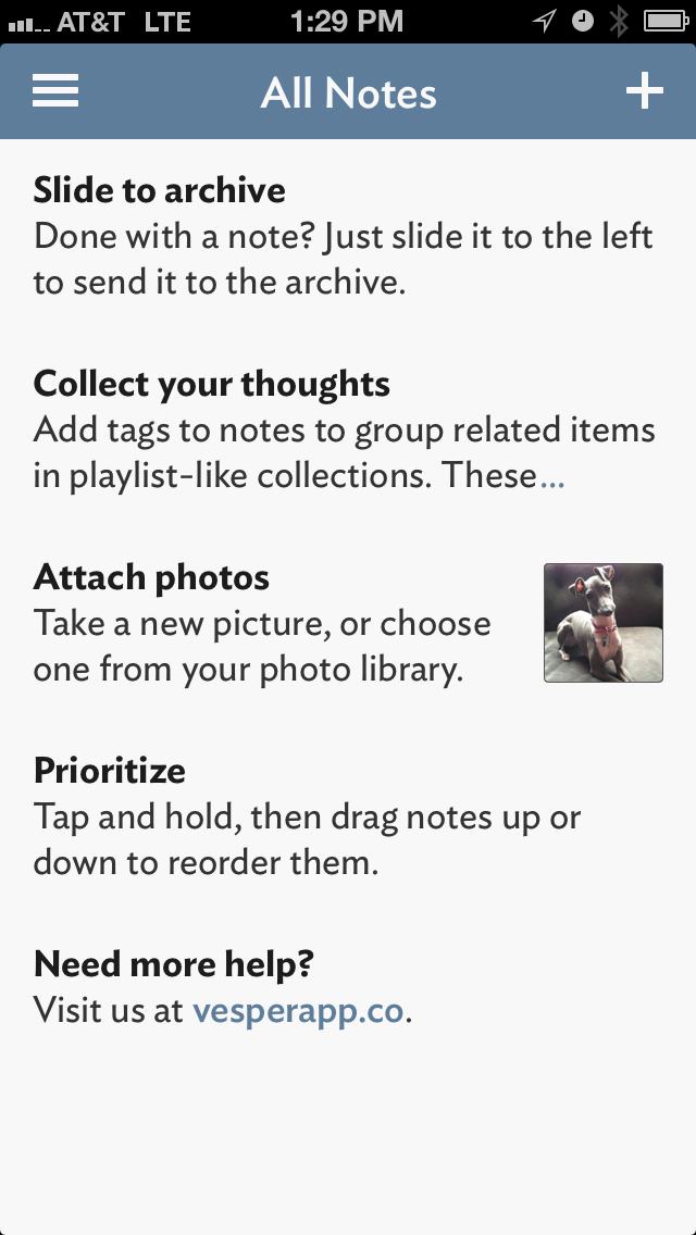 One of the first things you notice when you launch Vesper is how clean the interface is. As you can see in the screenshot to the right, Q Branch used the bare minimum interface needed to support the functions of the app. In his post-mortem on the design of Vesper, Wiskus commented on the influence of the bare visual style of Letterpress:
As it happened, we were all heavily addicted to Letterpress, and we wondered aloud if that visual style might be where the puck was headed. If so, what would that mean for UI in general? The only way to pull it off well … was to strip away everything and add back only the pieces that we needed.
As it turns out they were right on the mark. This style of clean, edge-to-edge design that emphasizes content and deemphasizes the interface was exactly where iOS 7 was headed. As Jony Ive explained in the WWDC keynote address, “In many ways, we’ve tried to create an interface that is unobtrusive and deferential. One where the design recedes, and in doing so actually elevates your content.” And that’s exactly the effect we see in Vesper. Without toolbars, without even separator lines between table view cells, Vesper draws users’ eyes to the content so they can quickly access their information and be on their way. This deference to content is going to be a hallmark of iOS 7 design and will be something for all developers to keep in mind as they plan for the future.
In the end, though, Vesper is an iOS 6 app and there’s only so far that Q Branch could go in removing interface chrome and still have it fit visually within the iOS 6 ecosystem. The current iOS 7 beta goes even further than Q Branch could in removing interface elements, going so far as to use white navigation bars that blend in with backgrounds, and reducing buttons to mere words with no edge. With so few interface elements remaining in iOS 7, how can a developer draw attention to important parts of the display? The answer is color.
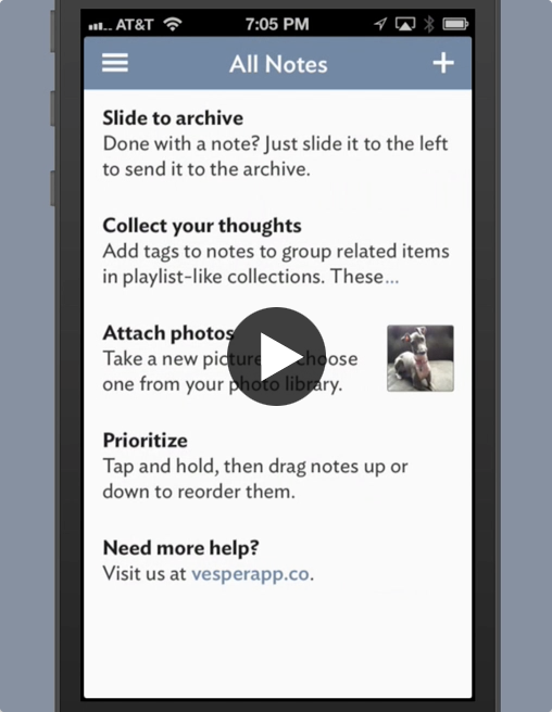 The developing convention in iOS 7 seems to be to colorize interface elements that are tappable or active, and to remove the color from elements that are inactive. Apple uses this convention in iOS 7 by desaturating interface elements that are “covered” by alert views, for instance. Vesper also uses this convention to great effect when the “hamburger” button is used to access the “basement”, as illustrated in the video to the right. As you watch the video, notice how the navigation bar smoothly animates from slate blue to white as it slides to the right. This color change is a subtle, but very effective way to communicate to the user that the navigation bar and its contents are no longer what is important in the interface once it’s slid out of the way.
Speaking of animation, it’s become clear from the WWDC Keynote that animation and movement are more important than ever in iOS 7. With so much of the interface chrome removed, animation has become the new affordance, giving hints to the user as to how different interface elements should be used. Animations in iOS 7 also serve the purpose of deference to content, which was mentioned earlier, by helping to provide continuity during screen transitions. This use of animation is illustrated very well by Vesper’s transition from a list of notes to an individual note.
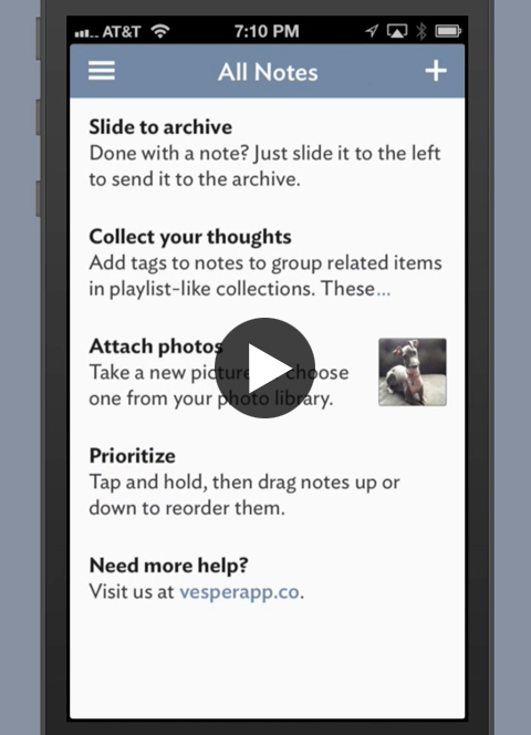 As you watch the video of Vesper’s screen transition to the right, notice that it lacks the usual slide animation that we’ve come to expect when “pushing” content onto a navigation controller. Instead, the thumbnail content smoothly animates to it’s final position and is replaced by the full content. By never pushing the visible content off the screen, and instead animating it into place, the eye is able to track the visible content through its journey, and thereby continuity is established between one screen and the next. This continuity immediately orients the user to the placement and purpose of the screen’s content in a way that a simple slide animation never could. This type of animation is used throughout iOS 7 and I think developers will find that clarifying animations such as this will become expected in apps as the iOS 7 ecosystem matures.
One concern that I repeatedly heard from developers at WWDC dealt with their ability to maintain individual identities for their apps when adopting an iOS 7 look and feel. After all, if most of the interface chrome is removed from apps, how can one app be distinguished from another? How can an app avoid being mistaken for a system app, or worse, a competing app? This problem is exacerbated because of the example Apple has set in the built-in apps shipping with the iOS 7 beta. Perhaps in yet another nod to deference to content, all the navigation bars in these built-in apps are either white or black, with color primarily found only in buttons and other controls. Under these conditions, it’s hard to see how an app based on a navigation controller can establish its own identity.
Vesper shows us a way, though. First it bucks the trend of the built-in iOS 7 apps by using color in the navigation bar. Yes, it’s flat color, but it’s still color. With the navigation bar extended under the status bar, lighter weight fonts, and perhaps a bit of transparency, it’s easy to imagine Vesper’s navigation bar fitting in nicely on iOS 7. The second way that Vesper creates its own personality is through its use of typography. Again in his Vesper post-mortem, Wiskus wrote:
Fonts were probably our single largest expense. We tried many, many faces in Vesper to see what felt right, and striking a balance required a lot of careful consideration.… Eventually we landed on our beloved Ideal Sans. But the story of Vesper’s typography doesn’t end there. We still had to consider weights, colors, placement, cap style, number style, then throw it all away and go back to Helvetica, only to realize what a huge mistake we’d made and beg Ideal Sans for its forgiveness.
The result of Q Branch sweating the details of typography is an app that feels at home on iOS, but that has a subtle style all its own. With the typography improvements in iOS 7 that were alluded to in the WWDC keynote, developers now have the ability to go beyond what Q Branch did with Vesper and create an even more impressive typographic style that’s all their own.
With so much of iOS 7’s new design anticipated by Vesper, it’s natural to wonder how much of this is coincidence. Did Q Branch get tipped off? Or is this just a matter of great minds thinking alike? Who knows. With this group of characters, it could be either or both. Ultimately, though, it doesn’t really matter. What matters is that now we all can see the new direction that iOS is heading. We know that in iOS 7, content is king. We know that in iOS 7, color and animation are more important affordances than ever before. And thanks to Vesper, we now know that it’s possible to combine these traits of iOS 7 to create a unique app that retains an individual identity while at the same time fitting into the rest of the iOS 7 ecosystem. If you’re one of the many now thinking about your own app and its transition to iOS 7, I suggest that you consider what lessons you can take from Vesper. It’s a great app, but I think we’ll soon see that it’s a great iOS 7 app as well.
Posted on June 22, 2013
I’ve been doing a lot of speaking over the last few months on the topic of accessibility in mobile software.1 The part that I enjoy most about these speaking engagements is the opportunity it gives me to talk to other mobile developers and designers after my presentation is over. In these conversations, I’ve noticed a few recurring themes. Over and over I hear developers lament, “I wish I had the time to do accessibility right!” or, “I know accessibility is important, but it seems too complicated.” To address these problems, I’m happy to announce that we are now offering accessibility consulting through Leaf Hut Software. Specifically, we now offer accessibility reviews and accessibility training for developers, designers, and their teams.
If you have an app and want to ensure that it is as usable as possible by people with disabilities, but lack the time or experience to properly implement accessibility, Leaf Hut Software is happy to help. We can review your app and provide a detailed list of what you’re doing right as well as specific suggestions that would improve the accessibility of your app for those with visual, motor, and other disabilities. For teams that require it, we also offer development services to implement the suggestions that arise through the review process.
If your team lacks experience with designing accessibility into mobile software and wants to learn more, Leaf Hut Software can help with that too. Courses are available to train your team in applying Universal Design to mobile software, and in implementing VoiceOver in iOS apps. Training can be customized to suit your team’s current level of experience, and can be tailored to suit teams of developers, designers, or mixed teams. Don’t let a lack of knowledge be the thing that holds you back from creating world-class apps.
Mobile software has proven to be a liberating and empowering technology that’s opened doors of opportunity for people with disabilities, and I believe strongly that accessible software should be made as available as possible to the people who need it. Let Leaf Hut Software help you put your apps in the hands of everyone who needs them. For more information about our accessibility consulting services, please see our consulting page. To inquire further about our services, you can contact us by email.
For the benefit of non-developers, “accessibility” in the context of software refers to making software as usable as possible for people with disabilities, usually physical disabilities. ↩